When you walk into a room, what’s the first thing you notice? The furniture? The finishes? The bespoke joinery?
Consciously, you might focus on those larger design elements, but subconsciously, your mind is absorbing something else: colour.
Colour holds a lot of power in interior design. It can impact your mood, change how spacious a room feels, and create balance between the architecture, lighting and materials.
It’s a subtle, yet powerful element of design – one we use to shape not only how a space looks, but how it feels to live in.
When designing a space, colour choices are never incidental. They’re carefully considered as part of the wider design strategy that ensures each palette enhances the atmosphere and emotional experience of the home.
What is colour psychology?
Colour psychology explores how different hues influence our emotions, behaviour and overall sense of wellbeing.
The tones we surround ourselves with can encourage calm, focus or creativity, and that means colour plays a much bigger role in how we experience a space than most people realise.
Studies in environmental psychology suggest that cooler tones, such as blue, are often linked to calmness and concentration, while warmer shades like red and orange tend to heighten energy and alertness. It’s one of the reasons why offices often lean towards cooler palettes, while restaurants and social spaces use warmer hues to create a sense of vibrancy and connection.
As designers, understanding this provides a foundation for making intentional colour choices – ones that enhance mood, balance atmosphere and reflect how a home is meant to feel.
Why colour psychology matters in interior design
In high-end interior design, every detail works together to create a mood. Colour is one of the most impactful ways to shape that feeling. It influences light, depth, and even the way we perceive proportion.
A considered colour palette can:
- • Make a space feel more balanced. Cool tones tend to recede visually, creating a sense of openness, while warmer hues advance and make larger areas feel cosier.
- • Encourage relaxation or productivity. The colours that surround us can support how we live. They can help us unwind in bedrooms or stay energised in workspaces.
- • Define open-plan living zones. Subtle variations in tone can signal a shift from one function to another, maintaining flow without visual disruption.
A home designed with colour psychology in mind feels calm, cohesive and personal – not because everything matches, but because everything belongs.
The emotional influence of different colours
While personal taste plays a role in colour selection, there are broad emotional associations supported by design research and colour theory.
Understanding these helps designers choose hues that not only look refined, but support how you want to feel in your home.
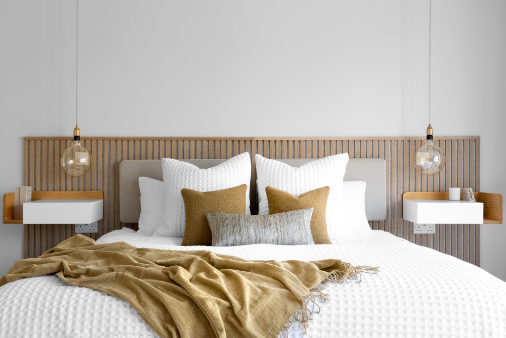
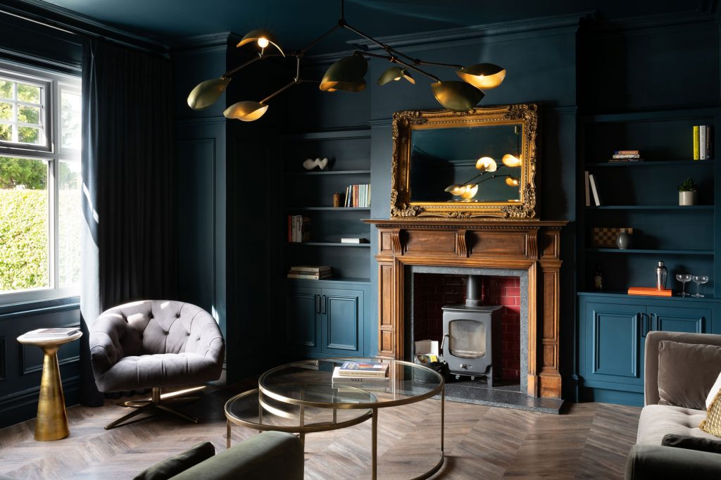
- • Blue creates calm, clarity and trust. It’s ideal for bedrooms, bathrooms or studies where relaxation or focus is key. Paler blues expand space and feel airy, while deeper shades bring intimacy and elegance.
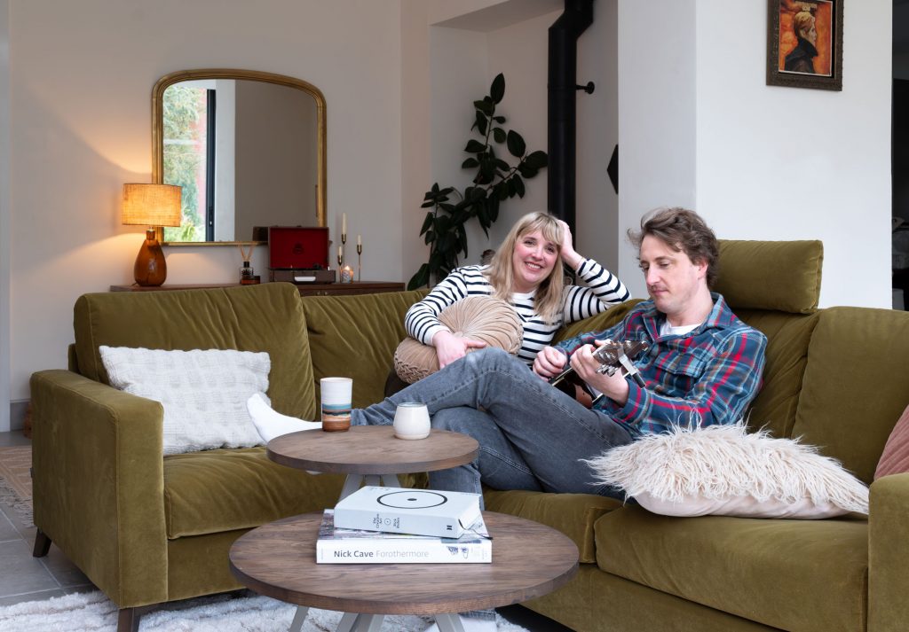
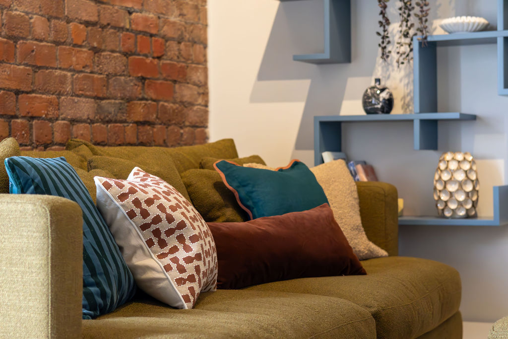
- • Green symbolises balance, renewal and connection to nature. Perfect for living rooms or garden-facing spaces. Muted sage and olive tones are particularly grounding and timeless.
- • Red conveys energy and warmth. It can spark conversation in social areas but can feel overpowering in large doses. Red is often incorporated through art, textiles or a feature wall to add vibrancy without dominating.
- • Yellow radiates optimism and brightness. When used thoughtfully, it can bring joy and energy to kitchens or hallways, especially where natural light enhances its warmth.
- • Neutrals – soft whites, taupes and warm greys – create clarity and calm, acting as a backdrop for layered textures and materials.
- • Charcoal and black accents add depth, structure and sophistication. Used sparingly, they help anchor lighter schemes and create contrast.
Lighting plays a key role here too. The same paint colour can appear entirely different depending on whether a room faces north or south. That’s why it’s so important to test samples in natural and artificial light before making a final decision (a process designers never skip).
How designers apply colour psychology in practice
Designing with colour psychology in mind isn’t about following rigid rules or chasing trends. It’s about understanding how colour interacts with light, space and the way you live.
Every decision starts by asking how a room should feel, not just how it should look.
Once that intention is clear, we can use colour to support it.
A bedroom designed for rest might lean towards cooler, desaturated tones that promote calm, while an entertaining space might feature warmer, more sociable hues that encourage conversation and connection.
Continuity throughout a home is also important. Subtle variations of tone can create a sense of flow from one room to another, allowing each space to have its own character without feeling disconnected from the rest of the home.
The trick is to maintain a visual rhythm – repeating undertones, balancing light and shadow, and creating subtle transitions rather than stark contrasts.
Light, both natural and artificial, plays a defining role in how colour reads.
South-facing rooms can handle cooler tones that balance bright daylight, while north-facing spaces often benefit from warmer shades to counteract cooler light.
Materials and finishes also influence perception; a matte wall absorbs light to create softness, whereas a gloss or satin surface reflects it, adding brightness and energy.
Finally, every palette is refined through testing – watching how a colour shifts throughout the day, and how it interacts with furnishings, flooring and natural light. It’s this process of observation and adjustment that makes sure the final scheme feels timeless and authentic.
Common mistakes people make with colour
Even with a strong sense of style, getting colour right can be surprisingly complex. A few of the most common mistakes include:
- • Choosing colours in isolation: A shade that looks perfect on a paint chart might clash with your flooring, fabrics or natural light. Always view it in context.
- • Forgetting about undertones: Neutrals often carry subtle warm or cool undertones. Mixing the two without intention can make a scheme feel off-balance.
- • Relying too heavily on trends: Trending colours can date quickly. Timeless palettes grounded in emotion and architecture tend to feel more authentic.
- • Not testing colours in real light: Paint can shift dramatically between daylight and lamplight. Observing it at different times of day is the only way to know how it will truly live in a space.
- • Overusing bold colours: Saturated tones make strong statements, but too many competing colours can feel overwhelming.
An interior designer’s role is to bring confidence and clarity to these choices ensuring every colour feels right for the space and for the people who live in it.
Bringing it all together
Colour psychology isn’t about theory for theory’s sake. It’s about creating spaces that feel intuitive and emotionally connected to the people who inhabit them.
When colour, texture and light all work together, a home feels calm, cohesive and unmistakably personal.
The right palette can lift your mood, enhance functionality, and add lasting value to your space proving that colour, when used with intention, really does make a house feel like home.
If you’d like to explore more ways to bring balance, mood and personality into your home, download our FREE Home Renovation Guide for expert tips on how to plan the perfect home renovation.